Photoshop Tutorial: How To Enhance Colors In An Image With Photoshop
By Elin Chow - Saturday, January 10, 2015

Photo By: Elin Chow
I am not a professional photographer and even though I own a Nikon D5100, most of the photographs which I have captured still require some kind of color enhancement before they look awesome. Thus, I am relying a lot on Photoshop to help me fix all of the problems in my photographs.
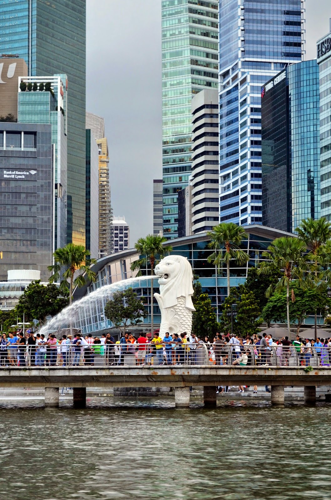
In this tutorial, I would like to share some of the color enhancement tricks I have learnt and used over the years for photo editing. The above is an image which I will be using for this tutorial. This is one of the photo which I had took while I was still living in Singapore. As the weather was extremely gloomy on that day, most of the photographs I took at that time comes out looking a little too dull and flat.
I will be using Photoshop CS5 for this tutorial, but older version as far as CS2 should work out as well too.

#1 Create a duplicate copy of your image to work on
Before you start to color correct an image, always remember to make a duplicate copy of it. This is to ensure that you still have a copy of the original image if you are not happy with the edited one. To make a duplicate copy, simply open your image in Photoshop and click File > Save As from the top menu. The duplicate copy will be one which you will apply all the adjustments to in Photoshop.
#2 Always work on a duplicate layer of your image
Whenever you open an image in Photoshop, a default layer named as "Background" will automatically be created in the layer palette. Before you start applying any adjustment to the image, always create a duplicate copy of the original and only work on that layer. You can do this either by using the keyboard Ctrl+J or right click on the Background layer and select Duplicate Layer from the menu that appears. Alternatively, you could also choose Layer > Duplicate Layer from the top menu or simply click on the create a new layer icon (the one with two white squares) at the bottom of the layer palette.
The good thing about working on a duplicate layer is that you could easily just discard the entire layer if you are not happy with the result since it will not affect the original layer.

With "Background" selected (the selected layer will be highlighted in blue), change the blend mode from Normal to Soft Light. The blend mode option can be found in the top left corner of the Layer Palette.
You could always lower the opacity percentage of the blended layer if the effect is too harsh or dramatic. Most of the time, I would keep the opacity in the 50% - 80% range to avoid making the image looking too unnatural.

#4 Apply a vector mask to the blended layer for selective adjustment
A vector mask is one of the most essential tool for me when it comes to photo editing. The vector mask feature in PhotoShop CS is a very simple but powerful tool that specifically allows you to selectively apply the adjustment to. To do this, you could either click on the vector mask icon (grey rectangle with a white circle in the centre) at the bottom of the layer palette and choose Layer > Layer Mask > Reveal All from the top menu or click on the
A solid white Vector mask thumbnail will immediately appears on the right of your selected layer. Layer Mask basically only use white, black and gray. White in a Vector mask means 100% visible and black means 100% transparent.
Just remember that blacks conceal and whites reveal. Whatever on that adjustment layer which you do not wish to apply to the image, paint those areas black on the Vector mask.
Proceed to flatten the image once you are satisfied with the blended result. To do this, you could either choose Layers > Flatten Image on the option bar or right-click on any layer in the layer palette and select Flatten Image.

The above shows how my image look like after applying a Soft Light blend mode on it. I believe you would have notice how the Soft Light blend mode has helped to increase the contrast of the entire image, making the colors appears more vibrant than before.

#5 Adjust the Shadows/Highlights to fix exposure problems
One of my favorite tonal correction tools in Photoshop CS is the Shadows/Highlights Adjustment. The Shadows/Highlights is a great feature in Photoshop that offers you the fastest and easiest way to correct the lighting in your images. I would often use this adjustment to fix both under and over-exposure problems in my most of my images.
I will be using the Shadows/Highlights adjustment to brighten up the shadows a little bit and bring out more details in the image. To activate the Shadows/Highlight adjustment in photoshop, simply go to Image > Adjustment > Shadows/Highlights in the top menu.

Before we start adjusting on the shadows/highlights, let's quickly duplicate a copy of the Background layer again. Once you clicked on the Shadows/ Highlights option, a dialog box will automatically pop up on your screen. The dialog box has two sliders, one for brightening shadows and the other for brightening highlights.
The slider affects the strength of the adjustment to you making to the image. The higher the percentage, the lighter the shadows and the darker the highlights. While you are adjusting, make sure that the Preview option is checked so that you will be able to see the changes as you move the sliders.
Similarly, apply a vector mask on the layer which you had applied the adjustment to. On the Vector mask, with black selected, paint over the areas where you do not want the Shadows/Highlights effect to be applied to. Since I have chosen to brighten the shadows, I painted over the areas that are originally bright such as the Merlion and specific parts of the surrounding buildings.
However, if you are using the Shadows/Highlights adjustment mask, you could just paint over in the white areas without needing to add a Vector mask to that adjustment mask.
Proceed to flatten the image once again when you are happy with the adjustment.

The above shows how the image looks like after applying a Shadows/Highlights Adjustment. Have you noticed that by applying a Shadows/Highlight, the image has now appears to be brighter with more depth.

#6 Exposure Adjustment to deepen the shadows
Next, I would like to add a little more depth to the image with the help of Exposure Adjustment. To activate the Exposure Adjustment, simply choose Image > Adjustment >Exposure from the top menu. Alternatively, you could also click on the half-black/half-white circle icon found at the bottom of the layer palette and select Exposure from the menu that appears. This will add an Exposure Adjustment mask on the layer palette.
I chose to use the top menu and once clicked, an Exposure dialog box will pop up on the screen. The dialog box comes with three sliders, one for exposure, one for offset and the other for gamma correction.
The Exposure slider increases the exposure of the entire image. The Offset slider darkens tge entire image, but mainly affects the shadows rather than the highlights. The Gamma Correction slider affects just the midtone and leave the shadows and highlights in the entire image untouched.
I will be using the offset feature to slightly deepen the shadows. Since I used it very minimally, the effect is not very obvious.
Apply a Vector mask on that layer again which you had applied the adjustment to. On the vector mask, with black selected, paint over the areas where you do not want the offset effect to be applied to. Since I only wanted to deepen the shadows, I painted over those areas without any shadows.
However, if you are using the Exposure adjustment mask, you could just paint over in the white areas without needing to add a vector mask to that adjustment mask.
Proceed to flatten the image once again when you are happy with the adjustment.

#7 Enriching specific colors with Hue/Saturation Adjustment
Since I have found that the blues and greens in my image to be a little bit too dull, I would like to enrich these two colors using the Hue/Saturation Adjustment in Photoshop. This Photoshop feature actually allows you to adjust the hue, saturation and lightness of a specific color range or all colors in your image. To apply the Hue/Saturation Adjustment in your image, you could either choose Image > Adjustment > Hue/Saturation on the top menu or simply click on the half-black/half-white circle icon found at the bottom of the layer palette and select Hue/Saturation from the menu that appears. Whichever way you prefer, always remember to apply all your adjustments on a duplicate layer.
Proceed to flatten the image once again when you are happy with the adjustment.

For me, I would prefer to click on the half-black/half-white circle icon which would bring the Hue/Saturation Adjustment dialog box up on my screen. In the dialog box, you will see a default option that is currently set to Master.
If you click on the Master Option, a drop-down list will appear, offering you a total of 6 options to choose from. For me, I selected Greens and Cyans from the drop-down list since I wanted to bring out the color of the trees and buildings in the image more. After you had the color that you wish to adjust selected, you could proceed to play around with the Hue, Saturation and Lightness sliders based on your liking.
To enrich and intensify the colors of the greens and blues, I have increased the saturation in both of the green and blue options. Once you are happy with the result, proceed to flatten your image.

#8 Color Balance Adjustment to balance out the colors
The difficult part is to identify which color you need to add or substract in your image. To apply the Color Balance Adjustment, go to Image > Adjustment > Color Balance or Ctrl + B to activate the Color Balance Adjustment dialog box.
I actually find my image to have too much blue and probably does not have enough green or yellow in it. Dragging the Yellow/Blue slider towards Yellow will add yellow and subtracts blue from the image.
Color Balance Adjustment is not always necessary. Most of the time, I will keep the Color Balance Adjustment as minimal as possible.
Proceed to flatten the image once again when you are happy with the adjustment.

One of the last step that I always love to do is to adjust the brightness and constrast of an image with the Brightness/Contrast Adjustment. To apply, simply choose Image > Adjustment > Brightness/ Contrast to bring up the Brightness/Highlights dialog box. You may proceed to make adjustment to your liking now.
Once you are done, add a layer mask to that layer which you have applied the Brightness/Contrast Adjustment to. On the Vector mask, paint over in black on whatever that you do not wish the adjustment to take effect. For those who could not decide, I would advise you to paint over those areas that are originally bright to avoid losing any additional details of the image. You might also want to paint over the shadows areas to add a little bit more depth to the image.

I have put a before-and-after image together for you to compare the differences. Obviously, the after image
However, remember not to over-adjust your image. The objective is to enhance an image without making it appear unnatural and wrong. A very difficult objective to achieve, but with lots of practices and patience, it should not be impossible. With that, I believe I have come to an end of my Photoshop tutorial.


0 comments